
Hapybara

Hapybara · Solo-Travel Startup · 2021–2022

Solo Traveler Matching Platform

Product designer · A 0-to-1 MVP for safer solo travel — verify who you travel with, match for fit, build trust after the trip.

01

Overview

Solo traveling has been trending up massively after Covid

Hapybara is a startup founded by two Chicago Booth entrepreneurs and their friends — all avid solo travelers, betting on a trend they lived: solo travel rebounded hard after Covid. The plan was a concierge MVP in Chicago by the end of 2022, funded through an application to the Polsky Center BUILD accelerator.

02

Understanding

Synthesizing with Solo-Travelers

We interviewed 16 solo travelers about their trips and what could be better, then synthesized the interviews in a product workshop. The pattern was hard to miss: people hunt for travel partners across forums, hostel boards and Facebook groups — despite the fraud and the friction — and their concerns cluster around safety and the social side of travel.
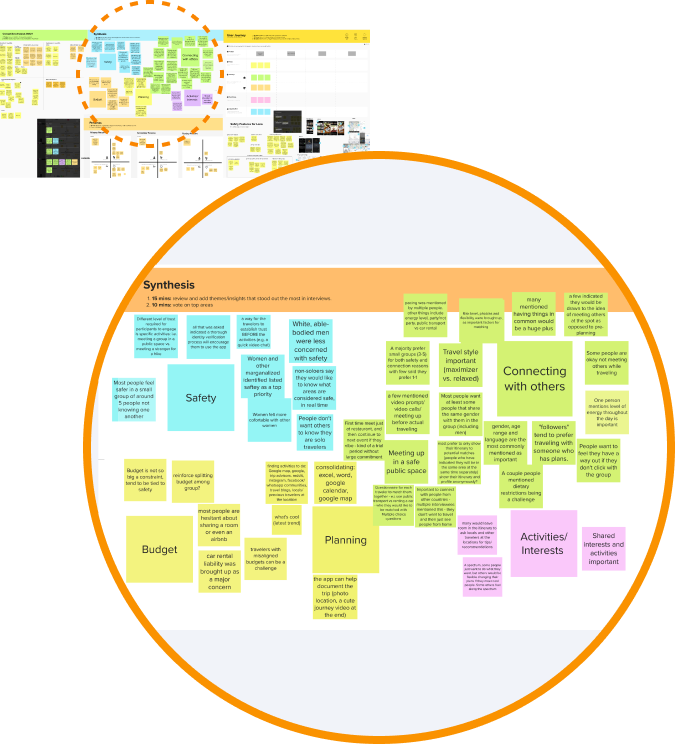
The interview synthesis board, magnified on its central cluster: colour-coded notes group under safety, connecting with others, meeting in a safe public space, budget, planning, and activities and interests.

Persona

Secondary research puts most solo travelers at 25 to 34; in our interviews, the ones raising safety and social concerns were mostly young women. The persona locked that focus for the MVP: design for the group carrying the most risk.
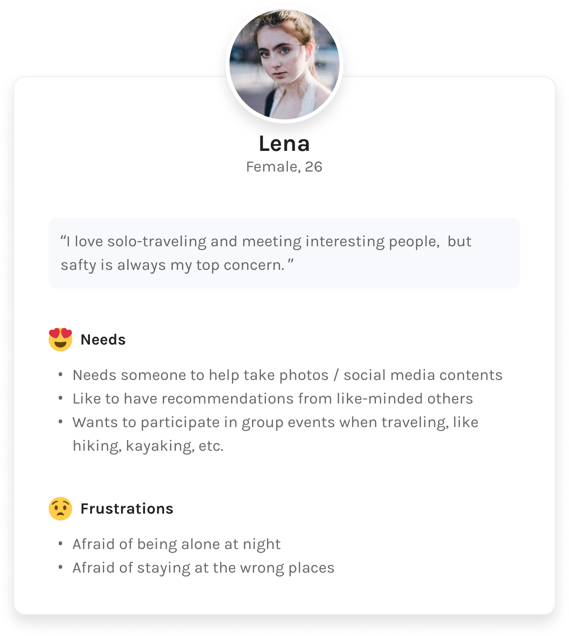
Persona card for Lena, 26, who loves solo travel but names safety as her top concern: she needs someone to help take photos, recommendations from like-minded travelers and group activities to join, and is afraid of being alone at night or staying in the wrong places.
03

Ideating · Design Workshop

A Strategy Focusing on Security and Compatibility

I ran an all-team design workshop to turn research into an aligned strategy: everyone brought sketched ideas; we reviewed, voted, and scoped together.

The workshop agenda as a four-stop timeline: competitor analysis (a feature matrix and evaluation), ideation brainstorm (a collaborative affinity map), sketch collage (each team member sketches), and team critique (a team vote on the scope of the MVP).
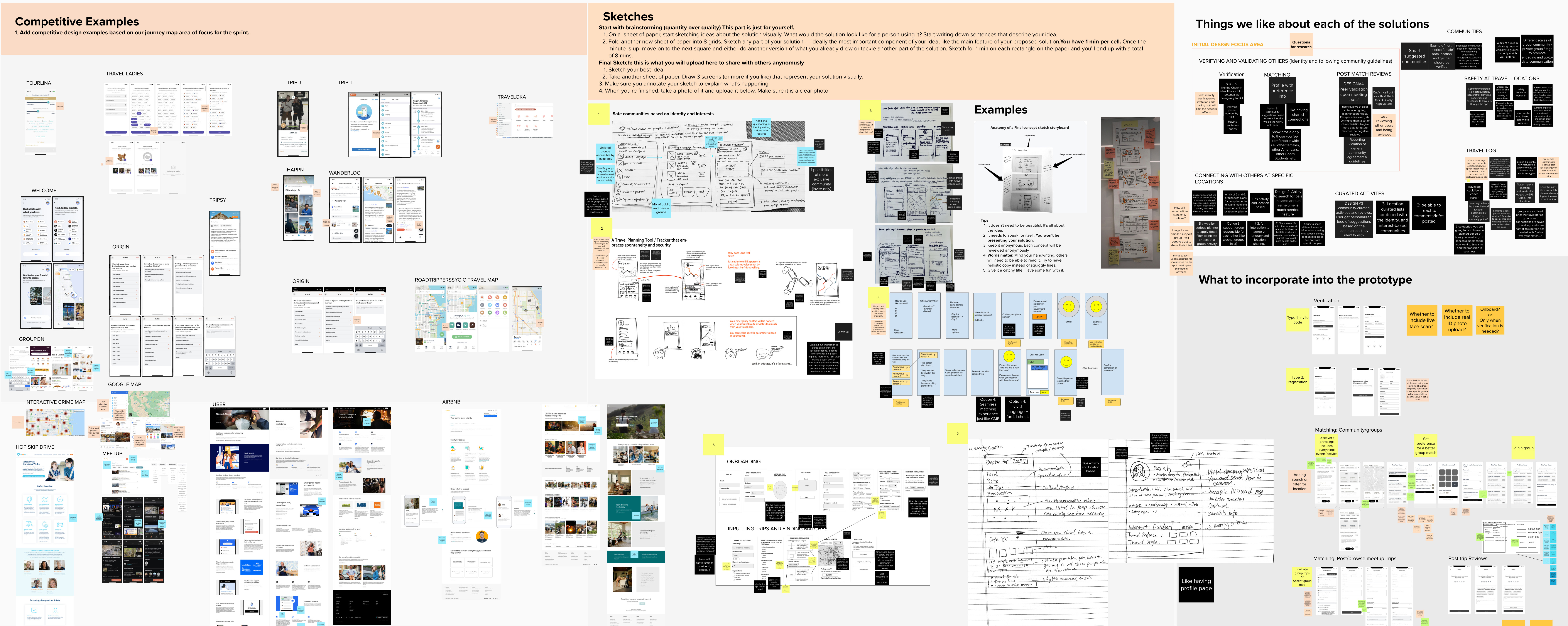
The workshop's Mural board: a wall of competitor screenshots, the sketching brief, everyone's paper sketches photographed in, and two columns capturing what the team liked about each solution and what to incorporate into the prototype.
The workshop’s Mural board.

Solution

The workshop landed on three design areas for the MVP — a better way to find travel partners, built on security and compatibility: identity verification, compatibility matching, and post-trip review.

The three MVP design areas as labelled icons: identity verification (a shield with a check), compatibility matching (a puzzle piece), and post-trip review (a speech bubble with a spark).
04

Information Architecture

Community + Group Trip + ID Verification

I sketched the IA to pressure-test how the system holds together. Four rules run through it.
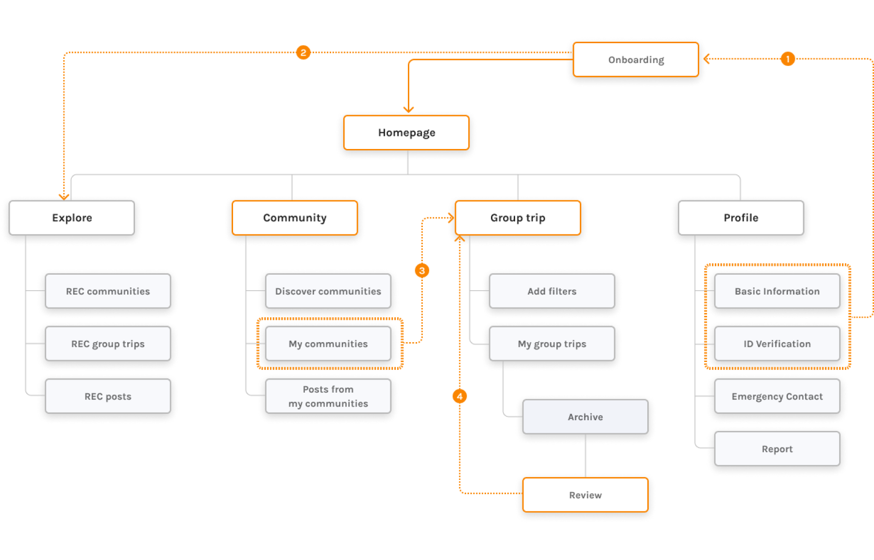
The first information architecture: onboarding feeds a homepage that branches into Explore, Community, Group trip and Profile, with numbered links showing ID verification inside Profile, onboarding driving Explore's recommendations, communities gating group trips, and the post-trip review feeding back into matching.
  1. Basic Info and ID verification is asked during onboarding process
  2. Contents are recommended based on info collected from onboarding process
  3. Groups that are exclusive to certain communities can be created
  4. Data collected from review is used to improve group matching function overtime
05

Prototyping

Mocking Up Key User Flows

The lo-fi prototype prioritized function over polish — built to be tested, not admired.
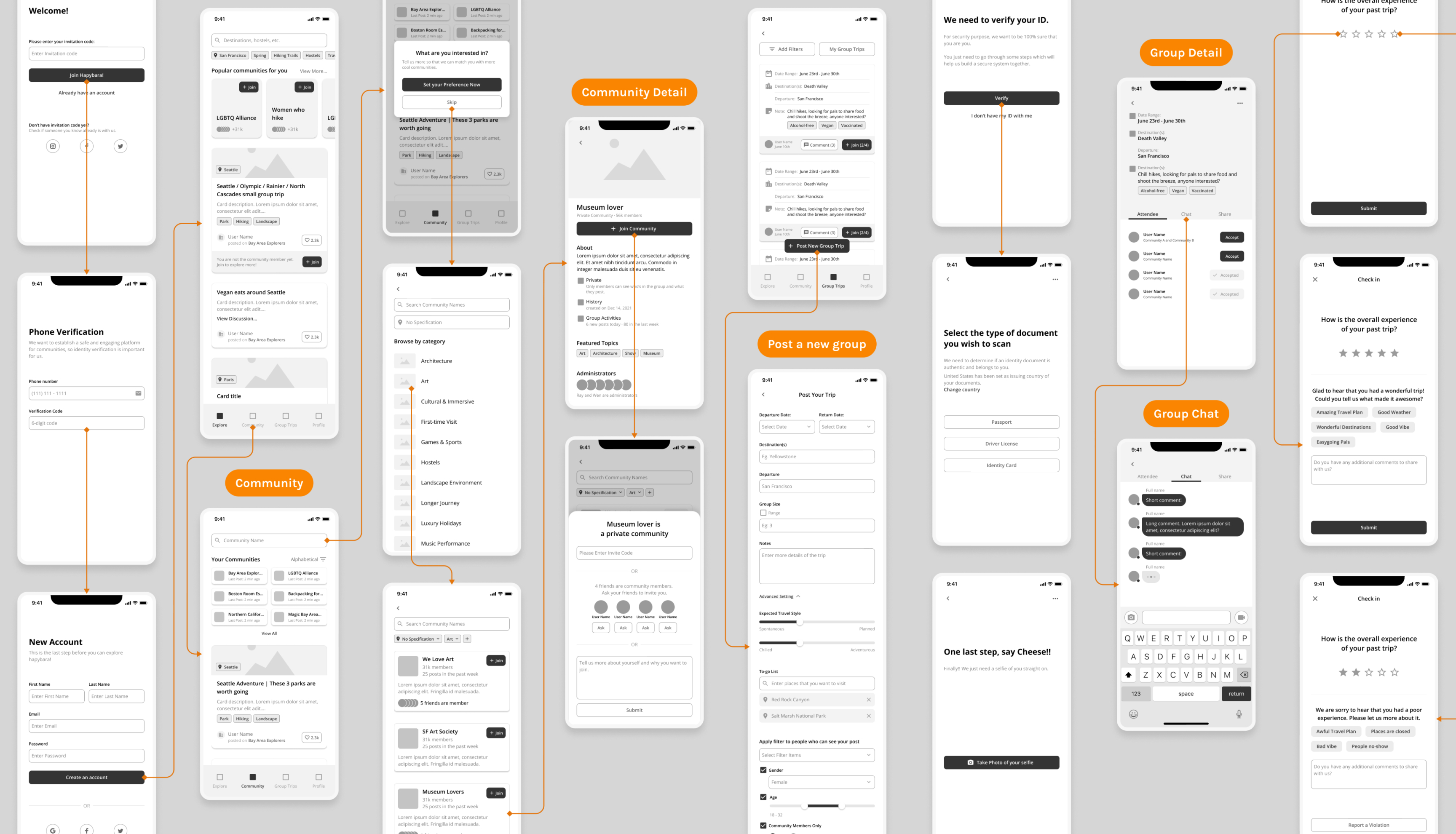
The lo-fi wireframe wall: every screen of the prototype laid out and joined by flow arrows, from sign-up and phone verification through communities, posting a group trip, ID document scanning and group chat to the post-trip review.

Iteration Schedule

Round one’s wireframe test surfaced problems I hadn’t anticipated — so I changed the plan rather than the ambition: build one user flow at a time, and test each finished flow while designing the next. That turned a single test into four rounds inside six weeks.
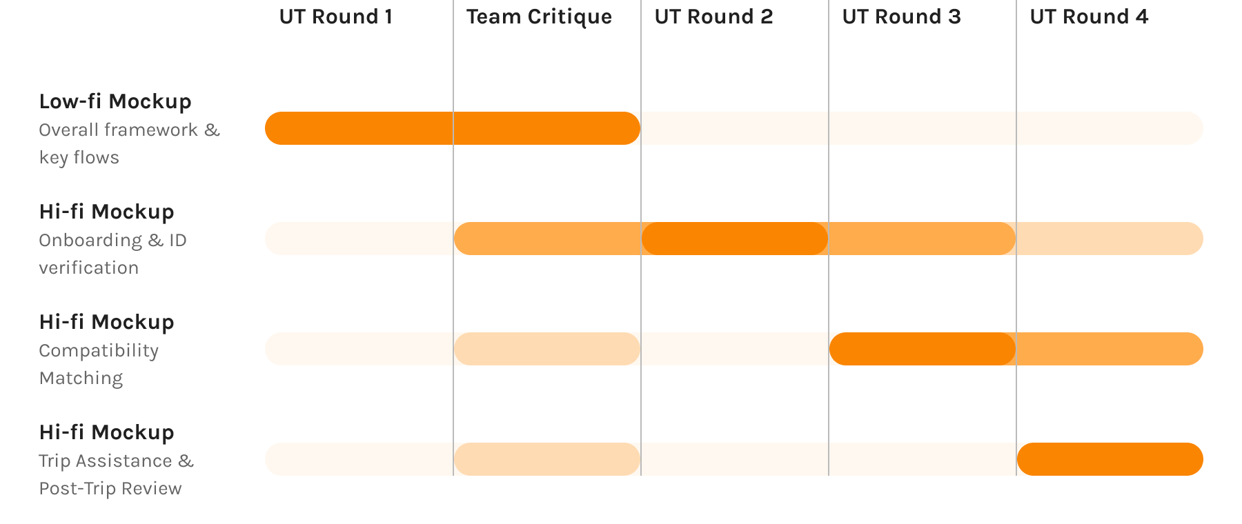
The revised schedule as a four-round band: the lo-fi mockup is tested in round one and the team critique, then each hi-fi flow — onboarding and ID verification, then compatibility matching, then trip assistance and post-trip review — enters testing as it is finished, so every later round covers one more flow than the last.
06

Testing

Round 1 Testing Insights

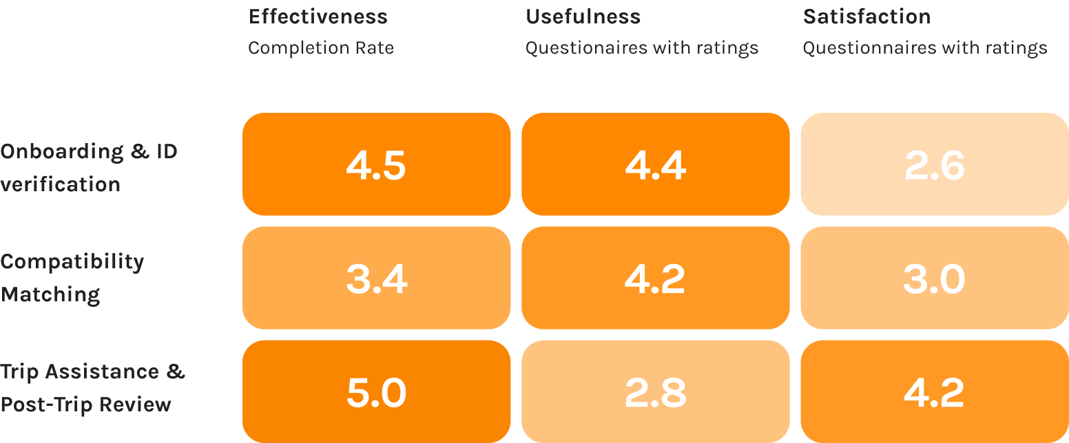
A severity metric quantified the feedback. It put usability problems in the first two areas — and a usefulness problem in the third:

  • Onboarding / ID verification: Not friendly, discouraging.“I feel like I am filling out a form.”

  • Compatibility matching: Too much to learn, too much friction.“There are just too many steps before I can finally post groups.”

  • Post-trip review: Users couldn’t see the point.“The trip is over and I’m unlikely to go to the same place again — so why do I need to do the review?”

The round-one severity grid: effectiveness, usefulness and satisfaction scored for each of the three design areas. Onboarding and compatibility matching score well on effectiveness and usefulness but weakly on satisfaction; trip assistance and post-trip review scores highest of all on effectiveness and lowest on usefulness.
07

Refining Information Architecture

Simplifying Compatibility Matching System

The community feature was the main casualty: it added cognitive load and build cost without earning either. We cut it, folding its value into an interest-preference setting — simpler to learn, cheaper to build, same promise. The revised IA below shows the delta.
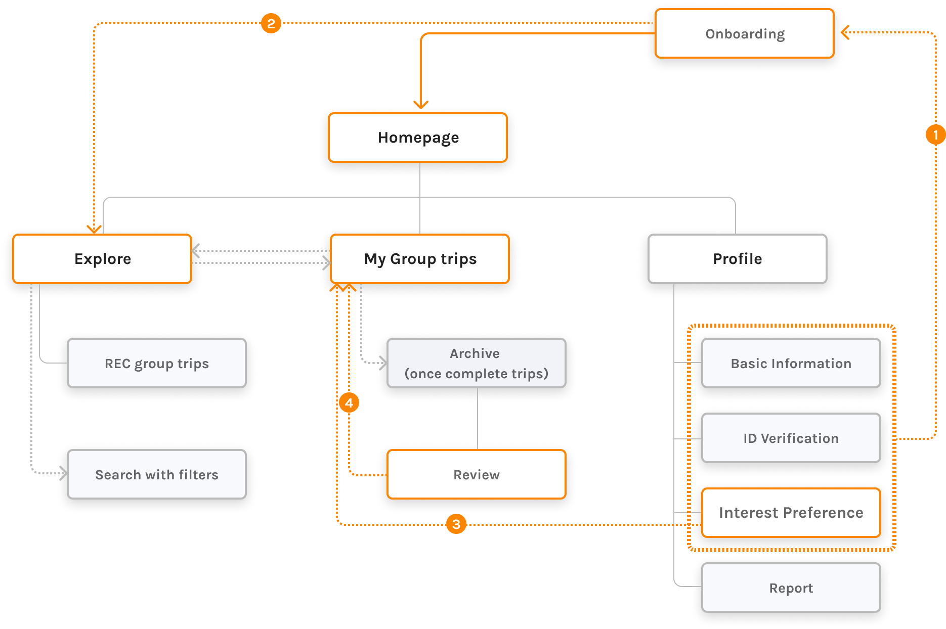
The revised information architecture: the Community branch is gone, the homepage now branches into Explore, My Group trips and Profile, and an Interest Preference setting joins basic information and ID verification inside the onboarding block that feeds recommendations.
  1. Basic Info, interest preference and ID verification is asked during onboarding process
  2. Groups are recommended based on interest preference from onboarding process
  3. Groups that are exclusive to people with certain identities can be created
  4. Data collected from review is used to improve group matching function overtime
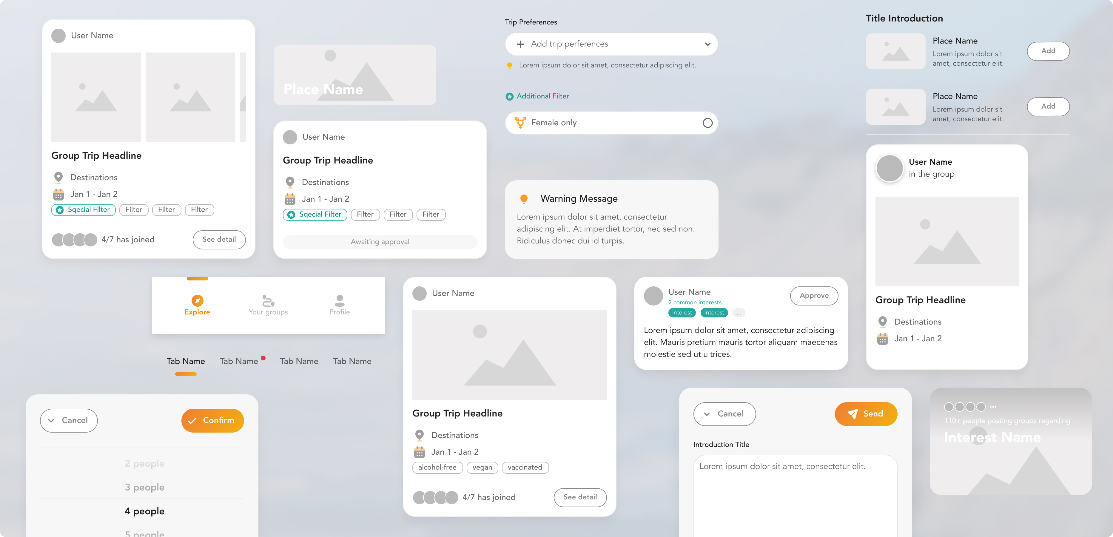
The prototype’s design system: group-trip cards, filter and preference chips, a tab bar, form fields, warning and approval messages, pickers and modals, all drawn from one set of components.
A complete design system, built for the prototype along the way.
08

High-fi Iteration

Onboarding and ID Verification Flow

1.1

Step-by-step onboarding

One decision per screen; guidance instead of form fields.
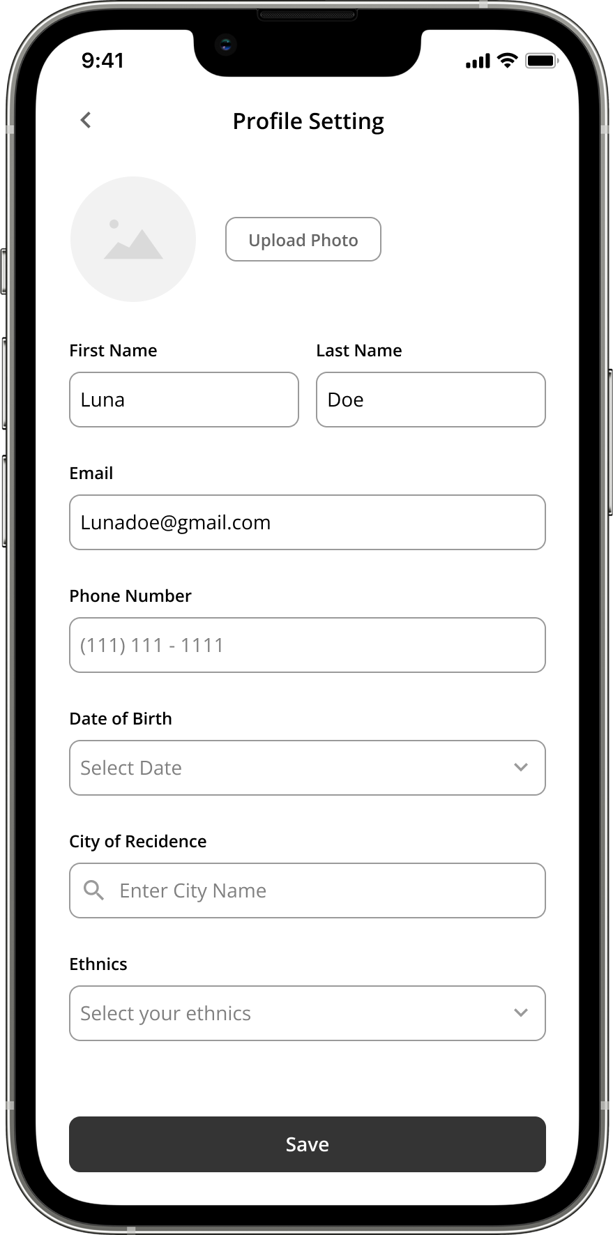
The profile setting as one long form: first and last name, email, phone number, date of birth, city of residence and ethnicity stacked on a single screen above a Save button.
1.2

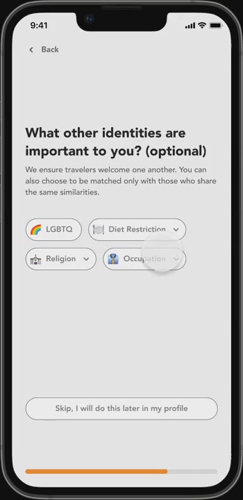
Interest preference

Show only high-level buckets first; the detail appears under the buckets the user picks.
1.3

Demonstrate benefits and show options to skip

Wherever effort is asked, the benefit is stated — and everything non-mandatory keeps a skip.
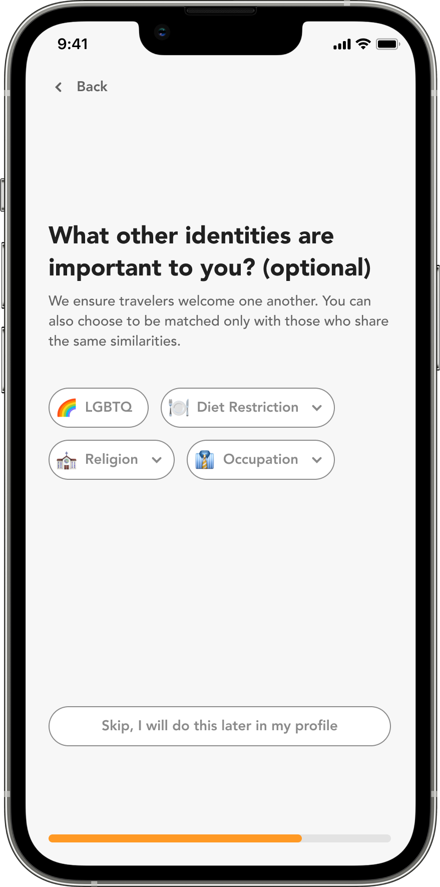
An optional identity step — LGBTQ, diet restriction, age range, religion, occupation — with a “Skip, I will do this later in my profile” link under it.
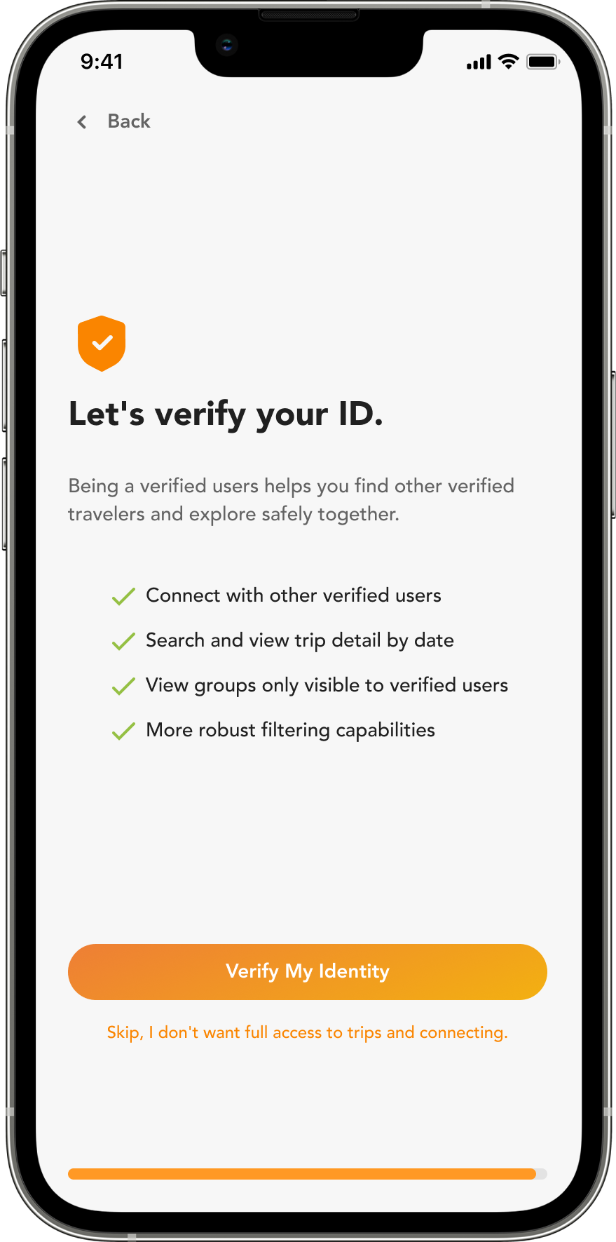
The ID verification screen listing what being verified buys — connecting with other verified users, seeing trip detail by date, joining verified-only groups, better filtering — above a Verify My Identity button and a skip link.

Compatibility Matching: Post / Search a Group

2.1

Clear guidance through posting and searching a group.
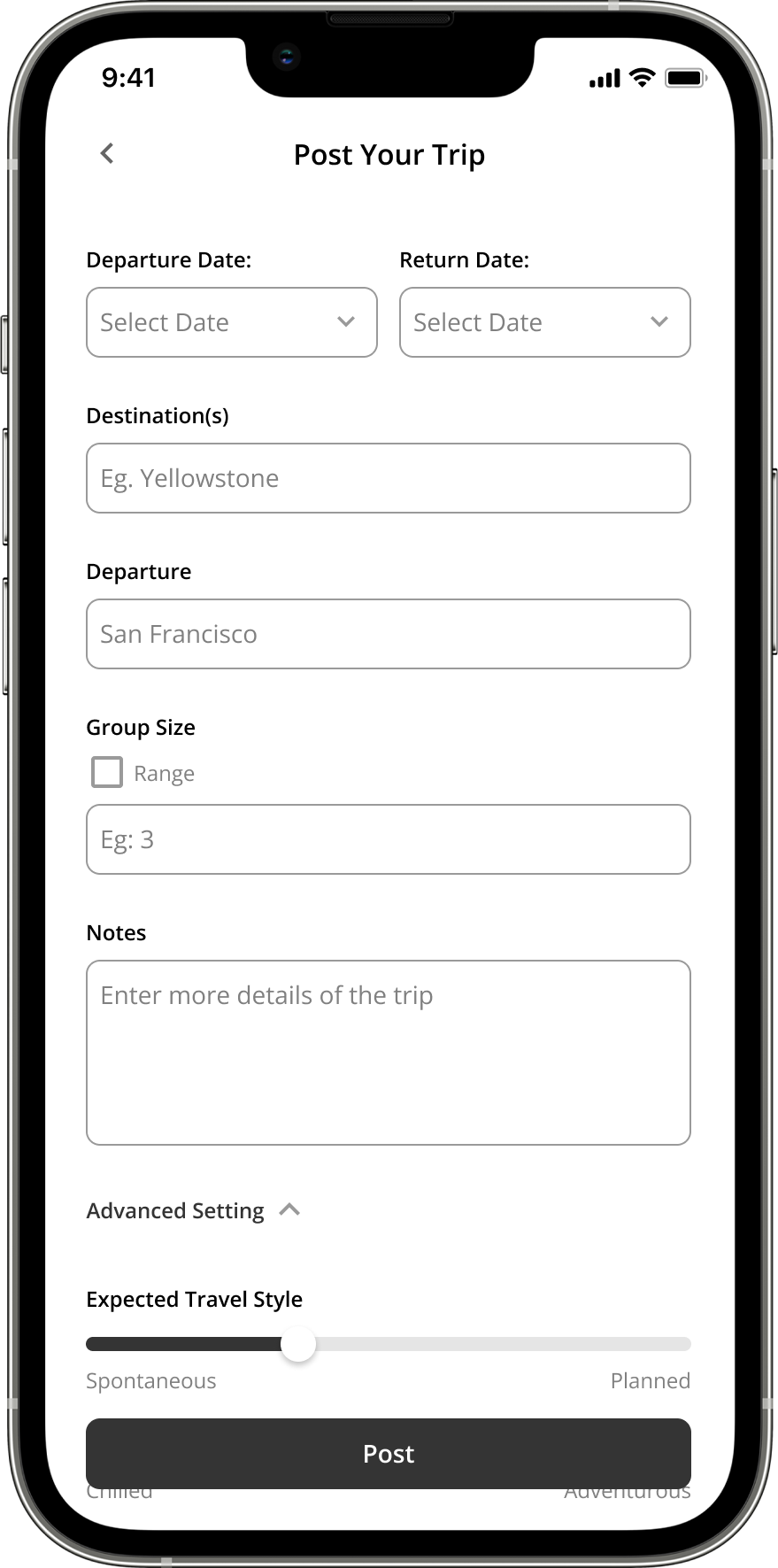
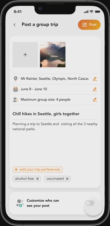
The Post Your Trip screen: departure and return dates, destinations, departure city, group size, notes, and an advanced setting for expected travel style.
2.2

Intuitive switch between “post a group” and “search ex. groups”

When a user posts a group, similar existing groups surface before the post screen opens.
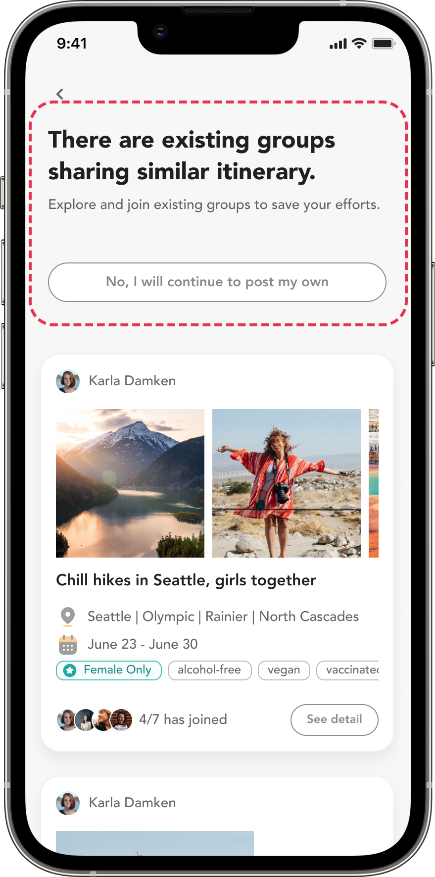
Before the post screen opens, an interruption: “There are existing groups sharing similar itinerary — explore and join existing groups to save your efforts”, with the matching groups listed under it and a “No, I will continue to post my own” option.

When a user searches existing groups and decides to post one instead, the destination and dates carry straight across into the post screen.
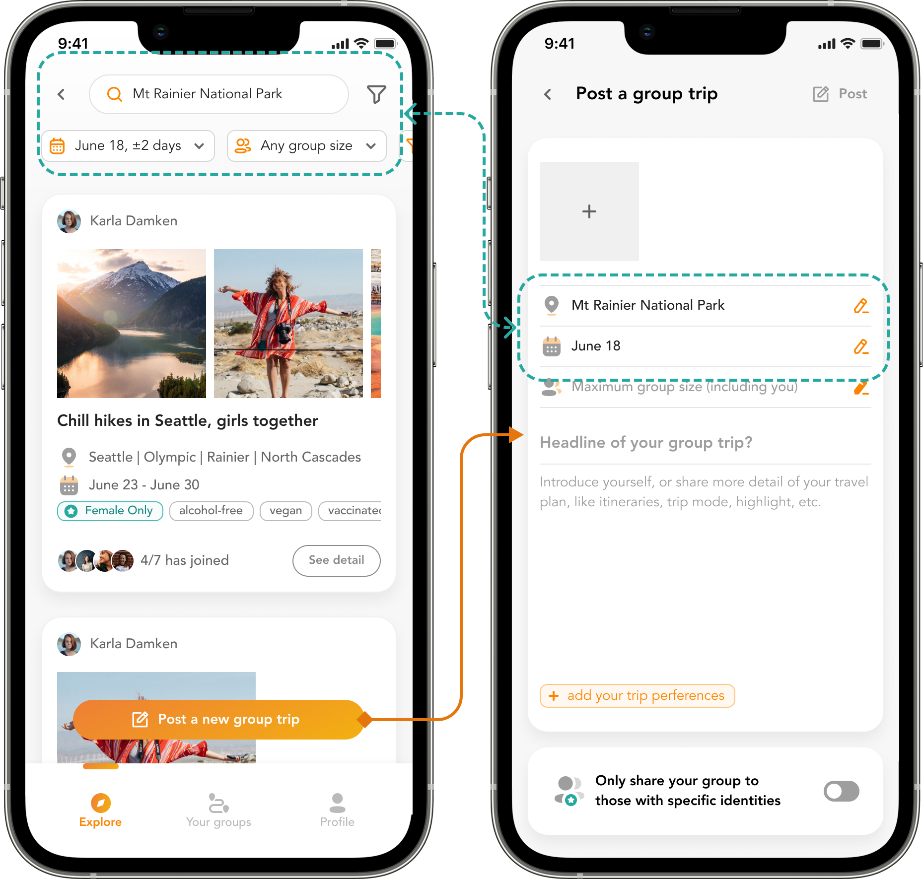
Two screens joined by an arrow: a group search for Mt Rainier National Park around June 18, and the Post a group trip form it opens with the same destination and date already filled in.
2.3

Exclusive groups: share a trip only with identities you trust, drawn from signup.
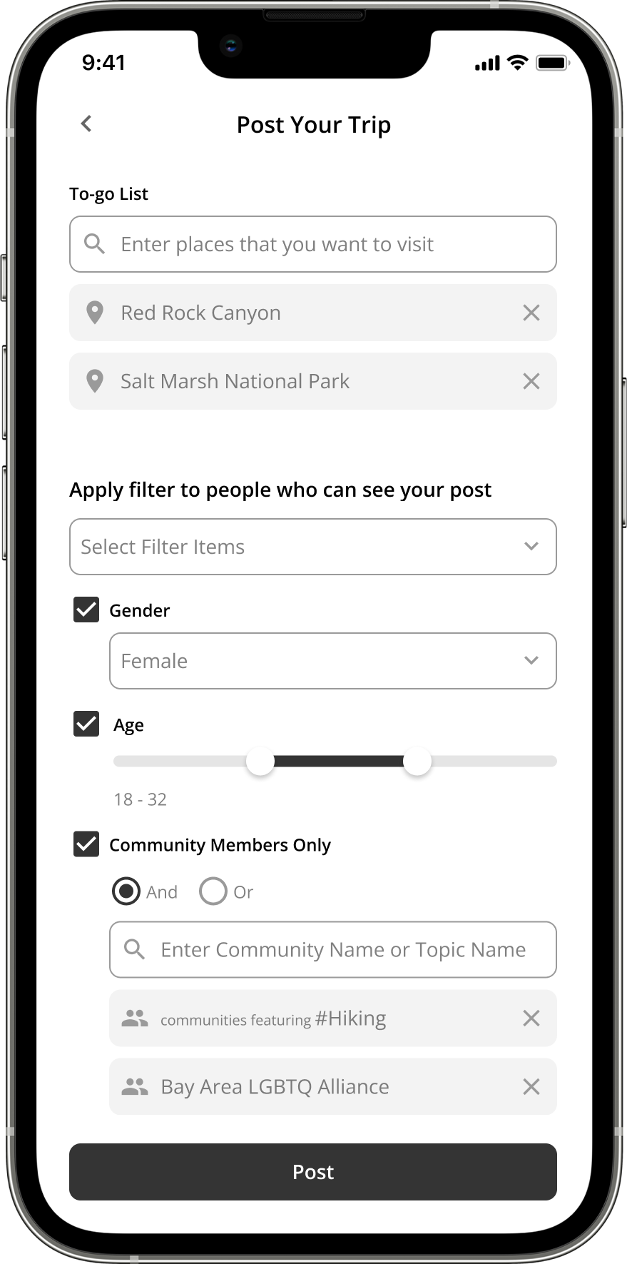
The post screen's audience filter: who can see this post, by gender and age, with a Community Members Only switch listing the communities the poster belongs to.

Trip Assistance & Post-Trip Review

3.1

The Overview screen features what testing said matters most the Share tab is gone; group notifications are in.
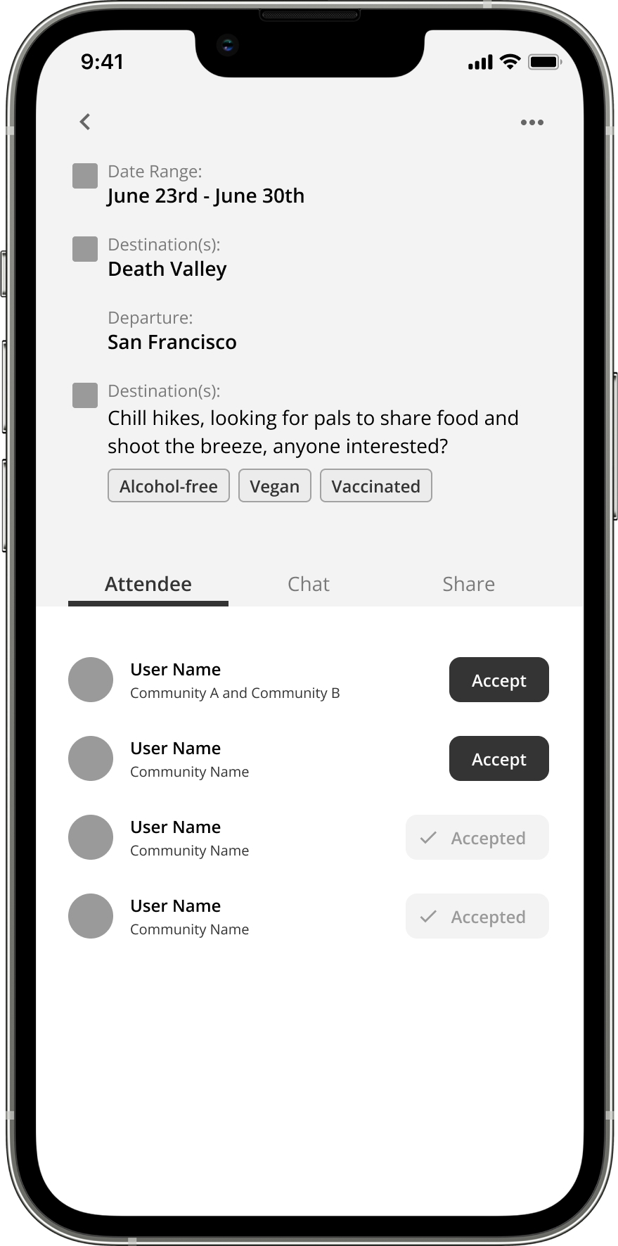
The earlier group screen, carrying Overview, Chat and Share tabs over the trip's dates, destinations and pending attendee list.
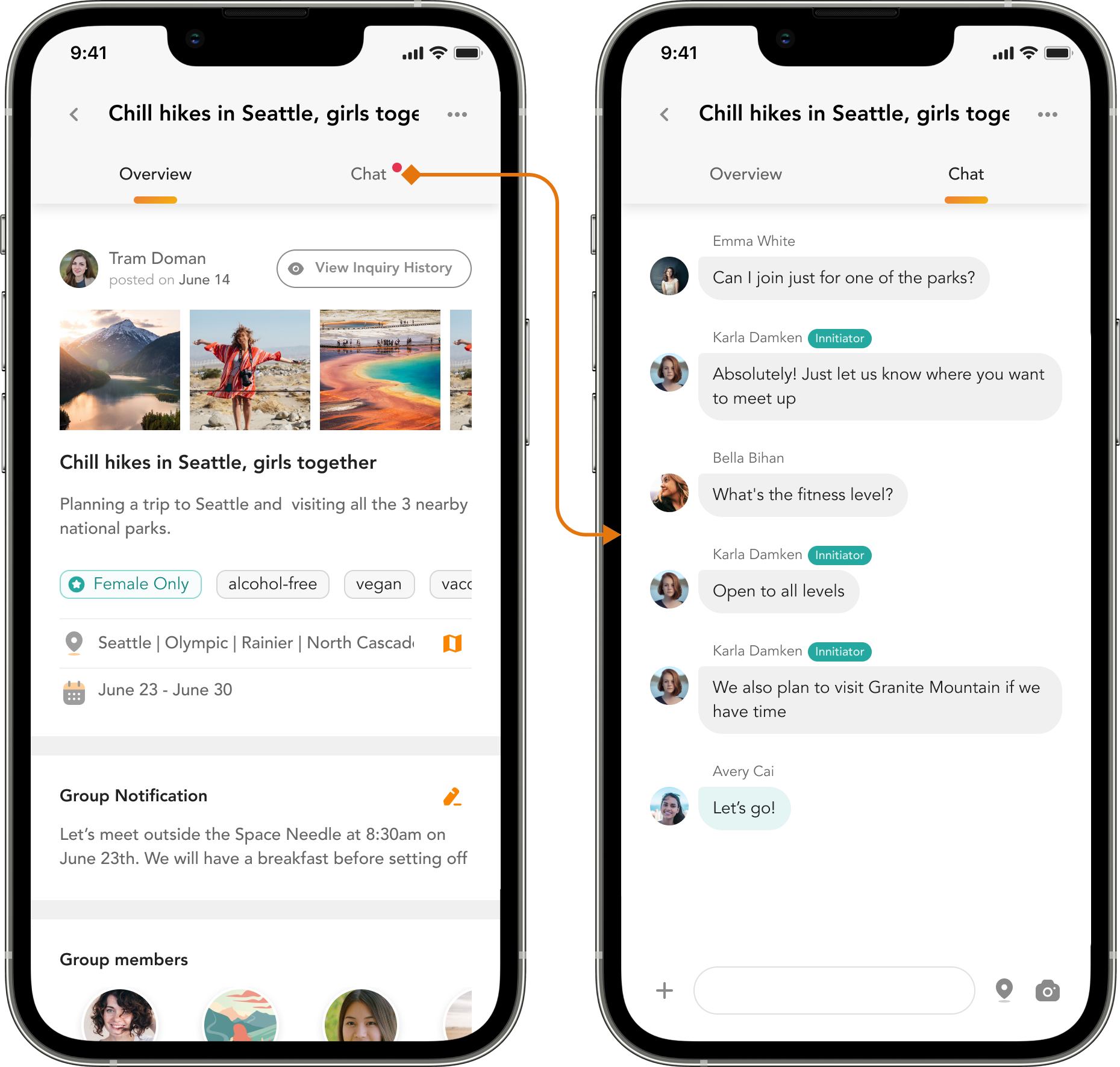
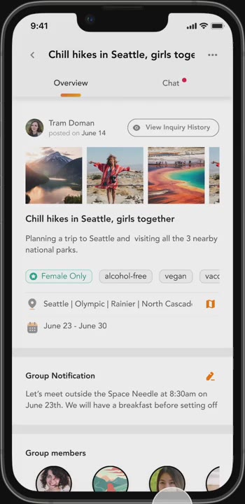
The revised group screen: two tabs instead of three, with a Group Notification block on the Overview and the Chat tab beside it.
3.2

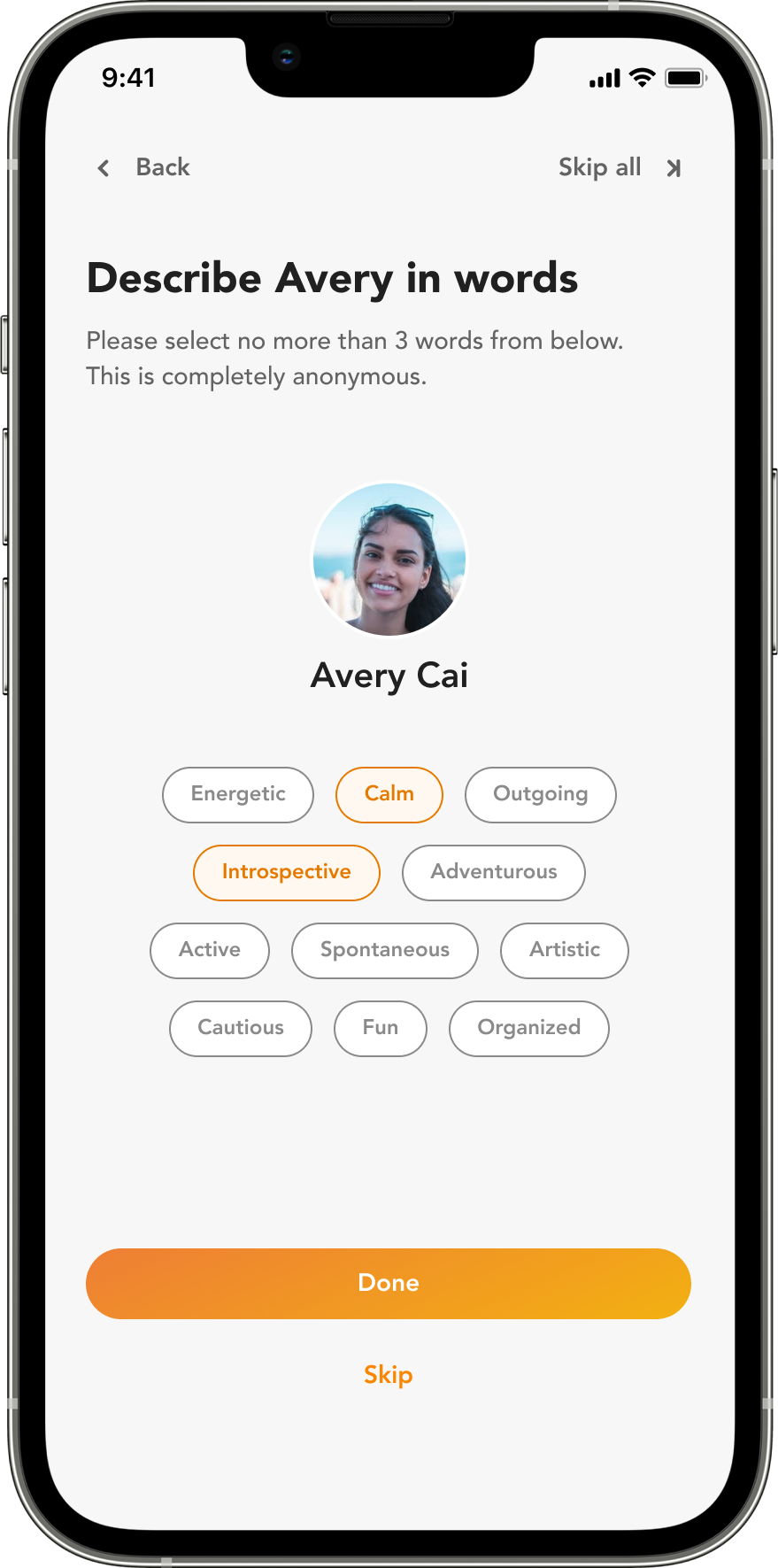
Review flipped from trip-based to people-based: the “why review a finished trip?” objection dissolves when the review is about people you might travel with again and the data feeds matching accuracy.
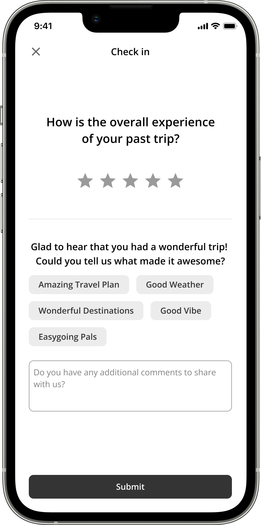
The trip-based review: a star rating for the overall experience of the past trip, then chips describing what made it good — the version users questioned the point of.
The people-based review: describe a specific travel companion in up to three words, chosen anonymously from a set of positive traits.
3.3

Profiles reflect personality: compliments are all positive words, each implying a travel style, so signal accumulates without anyone feeling judged.
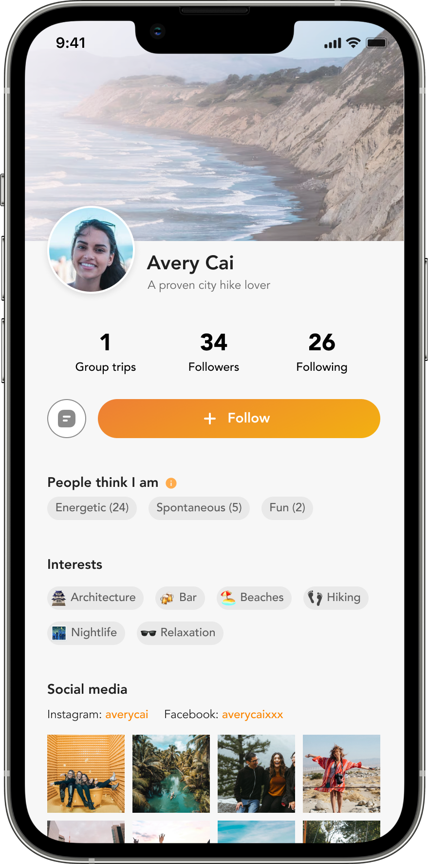
A traveler's profile: trip count, followers and following over a “People think I am” run of compliment words with the number of times each was given, then interests, social links and trip photos.
3.4

Real problems take a separate, private report channel.
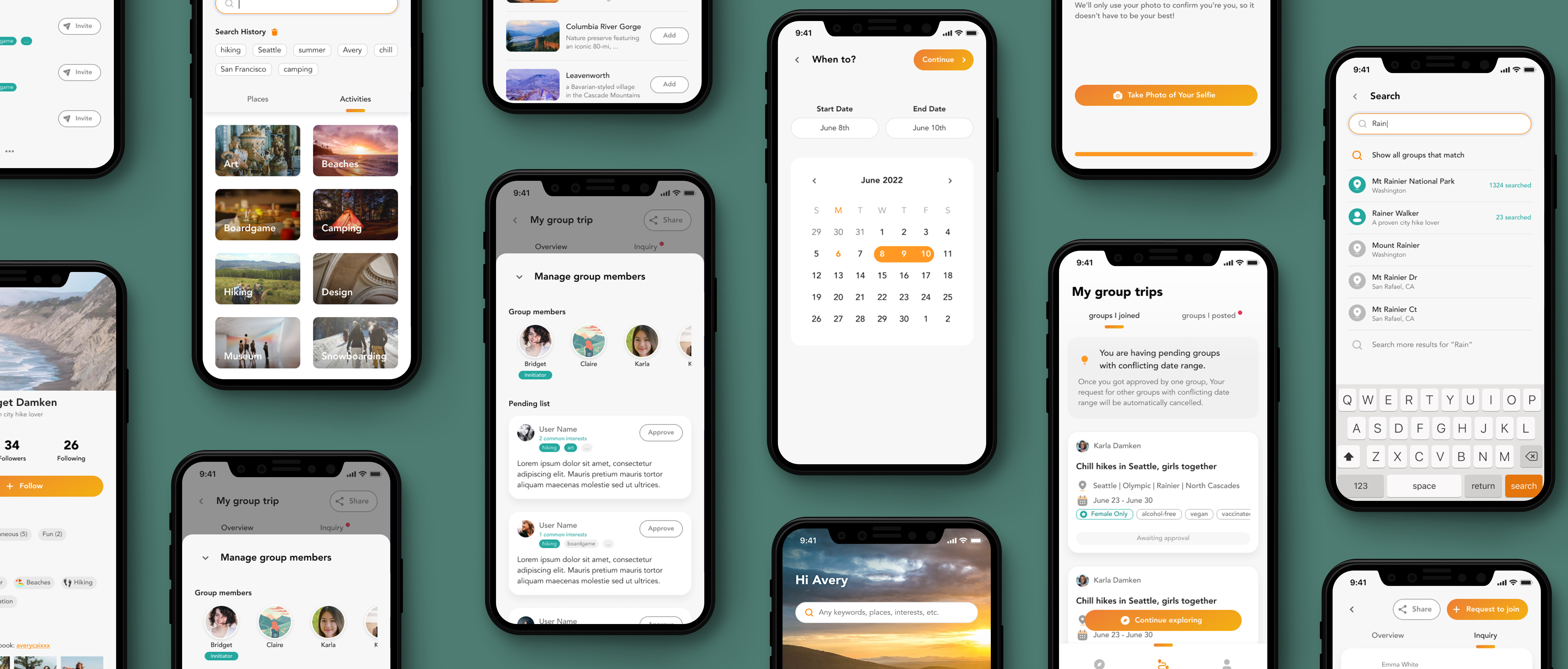
Eleven screens of the finished prototype on phones over a deep green ground: interest tiles and search history, group-member management, the date picker, the group trip overview, ID photo capture and search results.
09

Testing

Testing Feedback

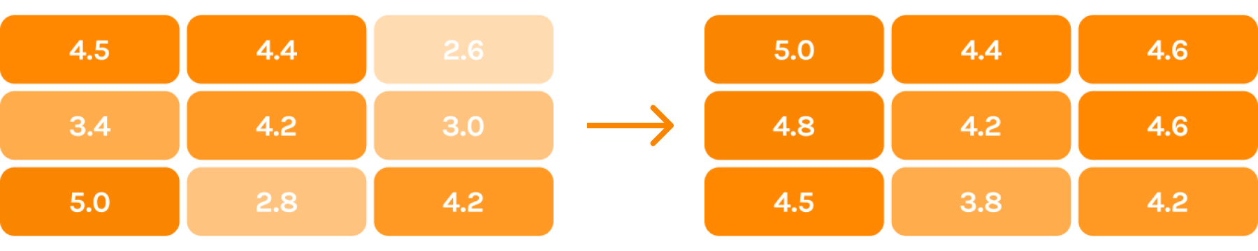
The final round came back positive across all three areas — the round-1 versus round-4 metrics show the distance covered. One honest remainder: some users still questioned the review’s usefulness. The redesign shrank the objection; the incentive question stays open.
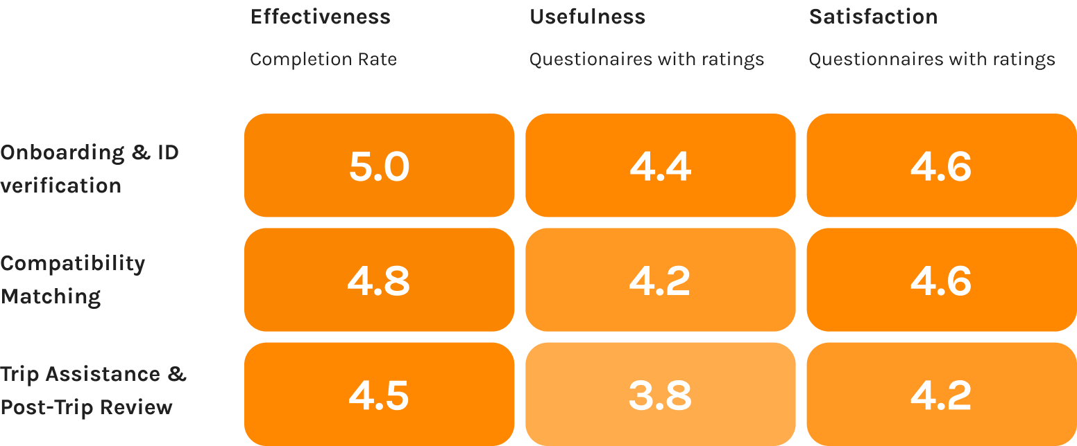
The round-four severity grid, same three areas and same three measures as round one: every cell has moved into the strong band except the post-trip review's usefulness, which is the one that stayed lower.
The two severity grids side by side with an arrow between them: the pale, low-scoring cells of round one are gone from the round-four grid, where only the post-trip review's usefulness is still short of the rest.
Comparison metrics — round 1 versus round 4.
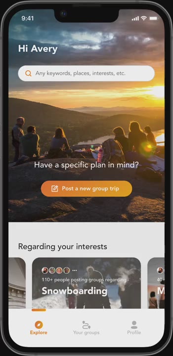
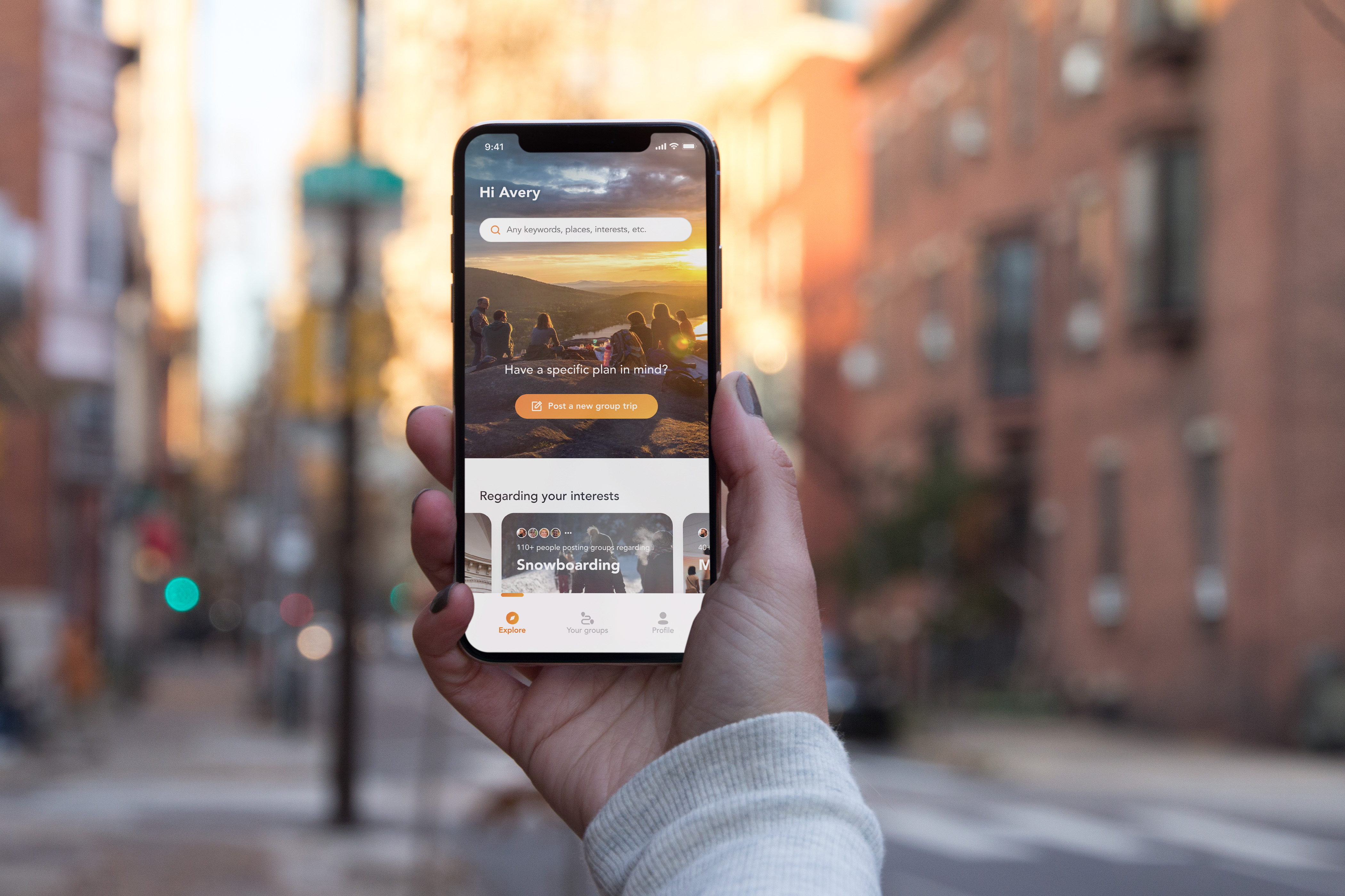
A hand holding a phone on a city street at golden hour, the Hapybara explore screen open on it.
10

Reflections

  • Revisit the persona

    Before each decision, ask: would she be happy with this?

  • Test early, test often

    Round one’s surprises were the cheapest we ever bought.

  • Bring engineers in early

    MVP scope defined with feasibility input, not corrected by it.