Pickle is a cutting-edge Zoom application specifically tailored for sales teams. Its primary objective is to empower account executives and sales leaders by offering in-depth analysis of conversational data through AI-driven conversation intelligence. This innovative tool aims to elevate sales performance and drive better results.
Despite the significance of the analytics feature as an AI-powered analysis tool, user engagement has been disappointingly low. As a critical component that conveys the core value proposition of Pickle, it is essential to address these design shortcomings urgently. By enhancing the design and functionality, we aim to improve user experience and ultimately, maximize the effectiveness of the application for our target audience.
Business Perspectives:
Amplitude data reveals a decline in dashboard engagement, with new users losing interest over time.
Pickle lacks an effective method for delivering summarized meeting data to users, putting us at a competitive disadvantage.
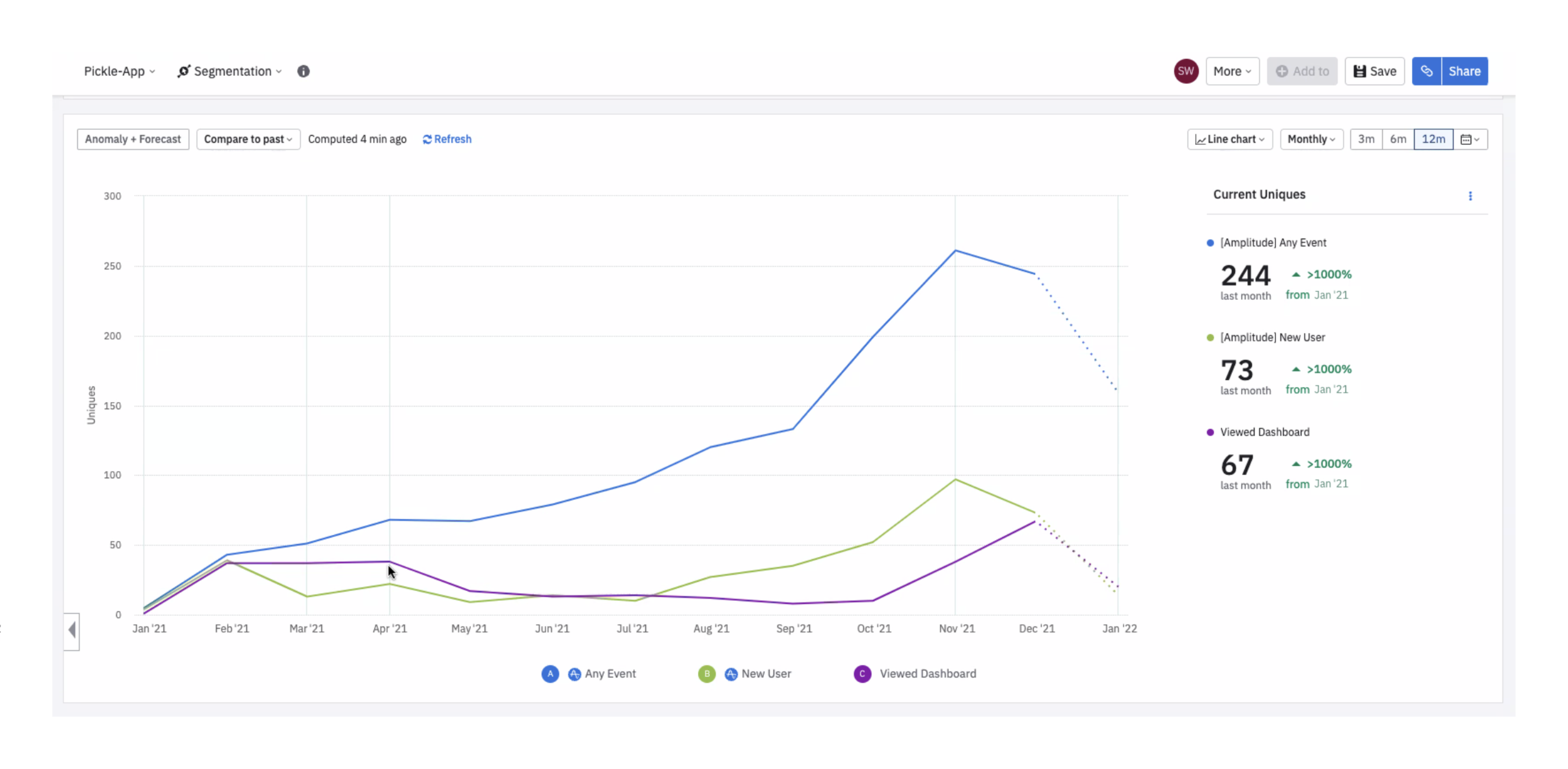
Amplitude Data for Picle product
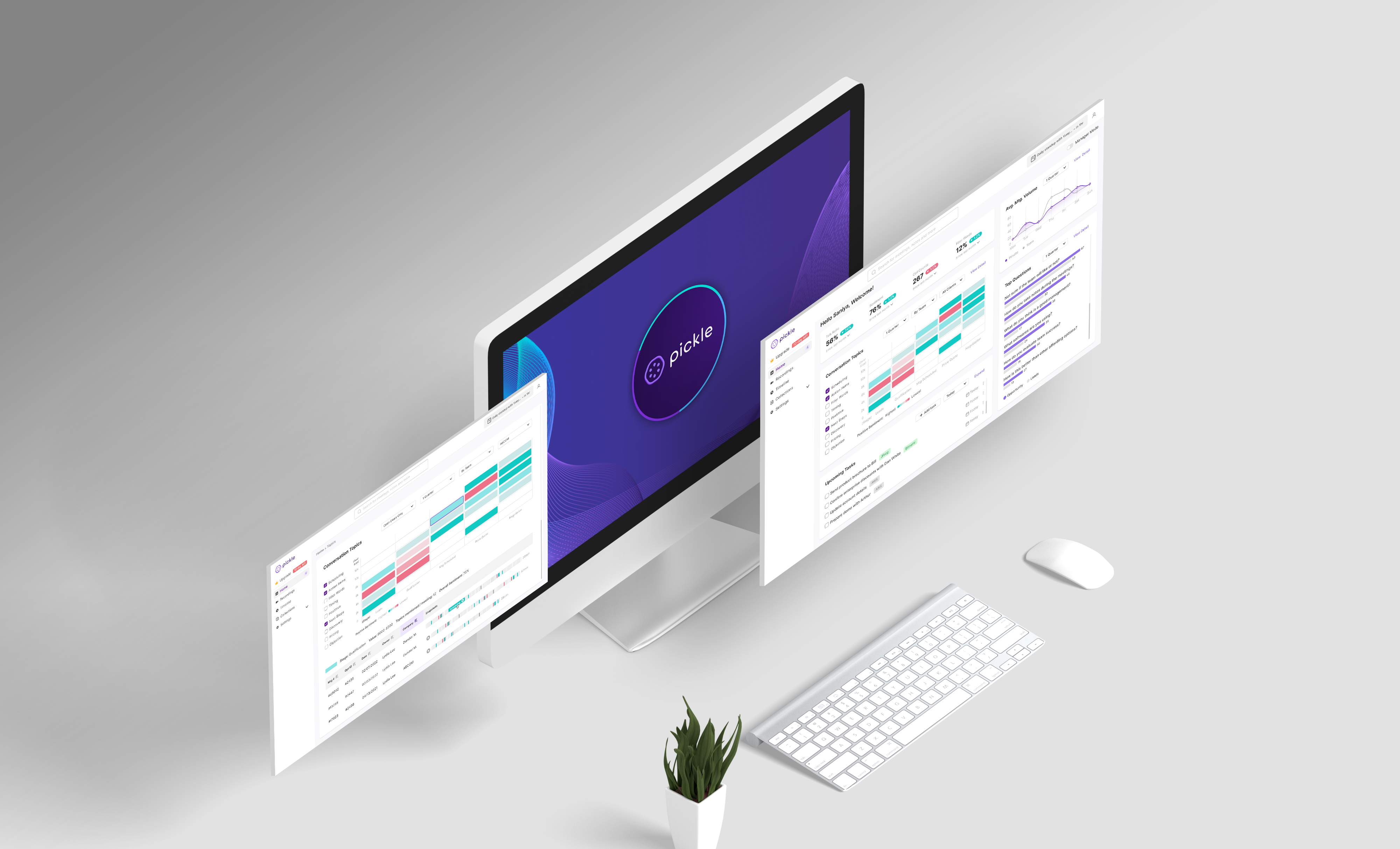
Pickle's old Analytic Dashboard
User Perspectives:
The dashboard fails to address sales teams' learning and improvement needs for sales conversion.
Users seek actionable insights rather than raw data.
Insufficient data specificity (e.g. internal/external meetings, meeting types) hinders user understanding.
The dashboard lacks clear next steps and conclusions.
Not intuitive user experience.
Project goals are crafted to encompass both user and business perspectives, with a focus on design-oriented outcomes.
Collaboration Journey Map Analysis
Drawing on previous user research, our UX researcher Saniya developed a user journey map that illustrates the collaboration process within sales teams, highlighting unmet needs and current workarounds.
Generating potential "User Stories"
Informed by the journey map and project goals, we identified three primary user stories to guide our design process during the ideation stage:
Following team alignment on sketches, our next objective was to create a clickable prototype for usability testing. In this case, the dashboard's legibility depended on colors (red vs. green for negative vs. positive) and actual copy, so a mid-fidelity prototype was developed.
The testing aimed to achieve three goals:
Validate core/premium usage metrics to help customers understand Pickle's ROI.
Assess the visual representation of these metrics.
Evaluate the usability of the Analytics Dashboard.
The prototyping process entailed adjustments at various levels, such as refining font sizes and spacing. Additionally, our UX researcher Saniya's input during the prototyping phase informed new design decisions.
Using the prototype, we tested with five users to identify any perceptible challenges. Key insights that informed the next iteration include:

Consolidate Information
Users prefer to access important data on one page without needing to navigate through top tabs.

Emphasize Visual Clarity
Users are averse to dense text and expect to intuitively discern data patterns at a glance.

Streamline Meeting Access
Account Executives value efficient access to useful snapshots for better call preparation.

Technical Constraint
(from engineers)
Certain features might take months to build, making them impractical for short-term launch.
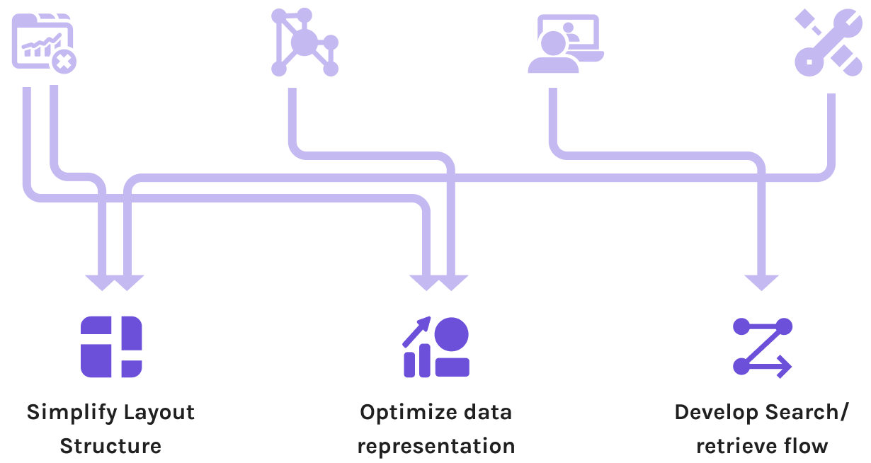
Focusing on the staff-mode homepage, I addressed insights gathered by dividing high-fidelity iterations into three focus areas: layout, charts, and flow.
Prioritize user needs
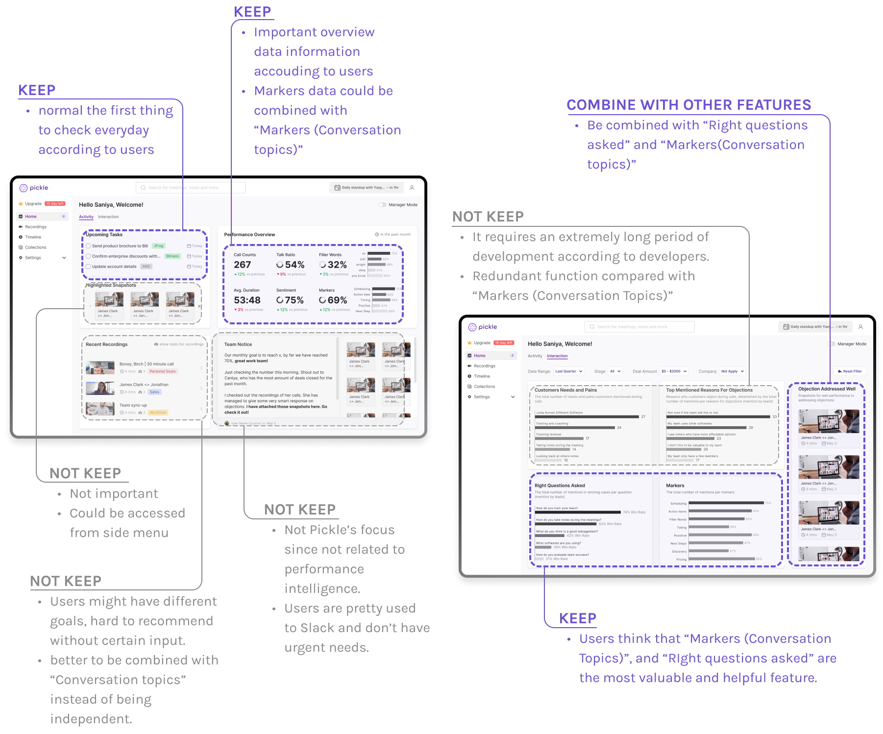
To refine the dashboard, I reassessed each feature, determining which to retain based on user preferences from testing and developer insights.

Optimize data representation
Selecting the optimal data visualization approach was crucial. Users expected intuitive and comprehensive data displays that revealed patterns and guided their work. Balancing intuitiveness and comprehensiveness, I iteratively adjusted charts to enhance clarity and usefulness.
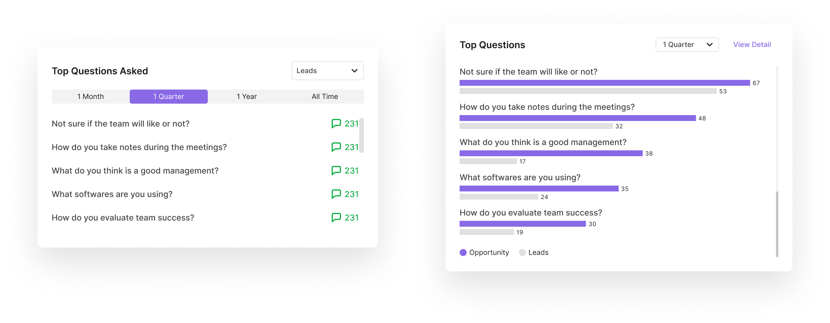
Iterations of "Top Questions"
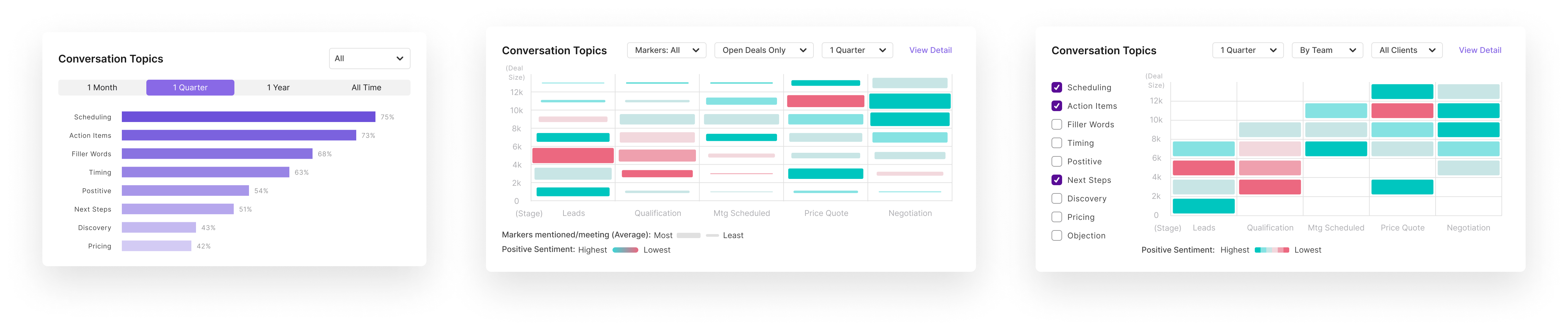
Iterations of "Conversation Topics"
Simplify layout structure
To convey information at a glance, I eliminated multiple tabs, which diluted the dashboard's purpose. By prioritizing features, I consolidated content onto a single page.
Iterations of Layout structure: "Topics" and "Top Questions" are the most important features in Pickle, so they also need to be visually emphasized in the dashboard.
Last iteration of the staff-mode dashboard
Perfection isn't achieved instantly. My initial design was far from satisfactory. By revisiting user feedback and identifying areas for improvement, I underwent several iterations to arrive at a more refined and effective version.
Develop search/retrieve flow
I conceptualized the search/retrieve flow, outlining how users access charts, explore detailed breakdowns, and locate specific transcriptions and snapshots.
This flow will be tested in the next development phase.

The revised analytic dashboard received positive feedback in the final round of user testing. the team observed significant engagement improvement after the launch.
Engagement rate = Analytic dashboard engagement / Overall engagement
Engagement = sum of key events x weight
6%
Engagement rate
for the first month (after feature launch)
14%
Engagement rate
for the second month
Choose the Right Data Representation:
Select graph types based on user needs.
Utilize established graph types, and exercise caution when inventing new data representations.
Design and Test with Strategies:
Establish a clear work plan before beginning the design process.
Understand Technical Limitations Before Starting Design:
Save time by considering technical feasibility for individual features before determining overall layout and integration.